Medusa Brewing Co.
Branding
The Medusa Brewing Company project required designing labels and a logo that best fit with what Medusa represented. “Boldly Making Beer Since 2015”, Medusa Brewing Company has award-winning brews like Duchovni and its success is pushing its home – the little town of Hudson, MA to new heights. Medusa takes pride in its innovations, for example by using an all-electric system that produces a better product and is better for the planet. While being “Different” is part of Medusa’s philosophy and distinguishes the company, it has also created issues for its branding: none of their beer cans have any form of consistency, which makes it hard for customers to spot their other brews in stores, the logo and name aren’t used well, and nowhere in the branding is there any association with the Greek mythological character, Medusa, who had a head full of snakes.
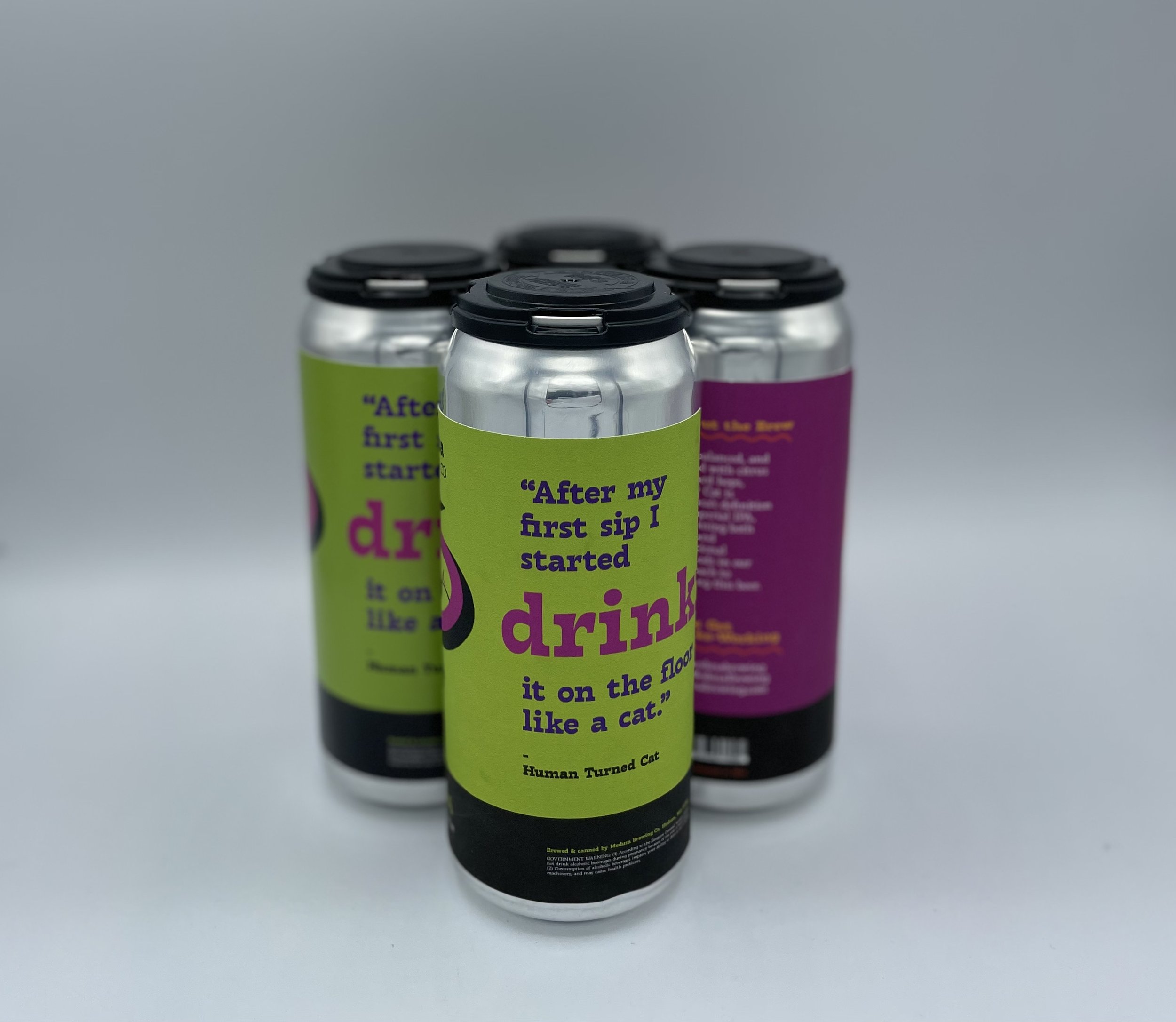
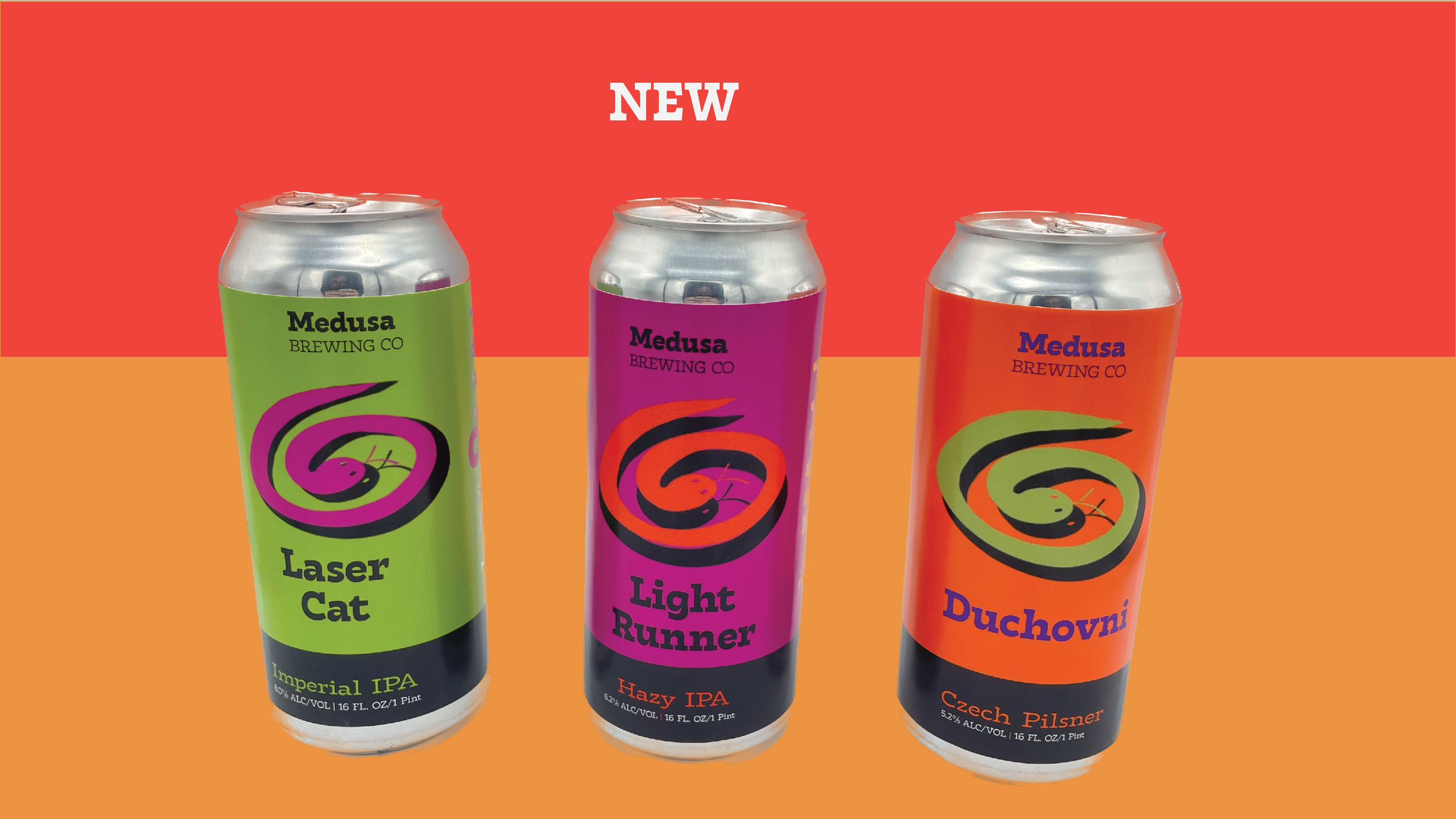
The re-design addresses all of these issues. The logo is in the form of a snake, using a curvy large family font and six different colors– one for each variety of beer. The consistency and colors provide a playful yet identifiable brand. This project enabled the designer to experiment more with color, type, and illustration. The labels were designed for 16 oz beer cans and the project was originally completed in December 2022.


