Boston Biker Survival Guide
Print, Branding, UX/UI
Inspiration for this the Boston Biker Survival Guide came from the designer’s love of biking and the annoyance and problems with biking in Boston things like cracks in roads and a patchwork of bad and decent bike lanes made the designer want to dig into the problem becoming even more informed about his knowledge of biking.
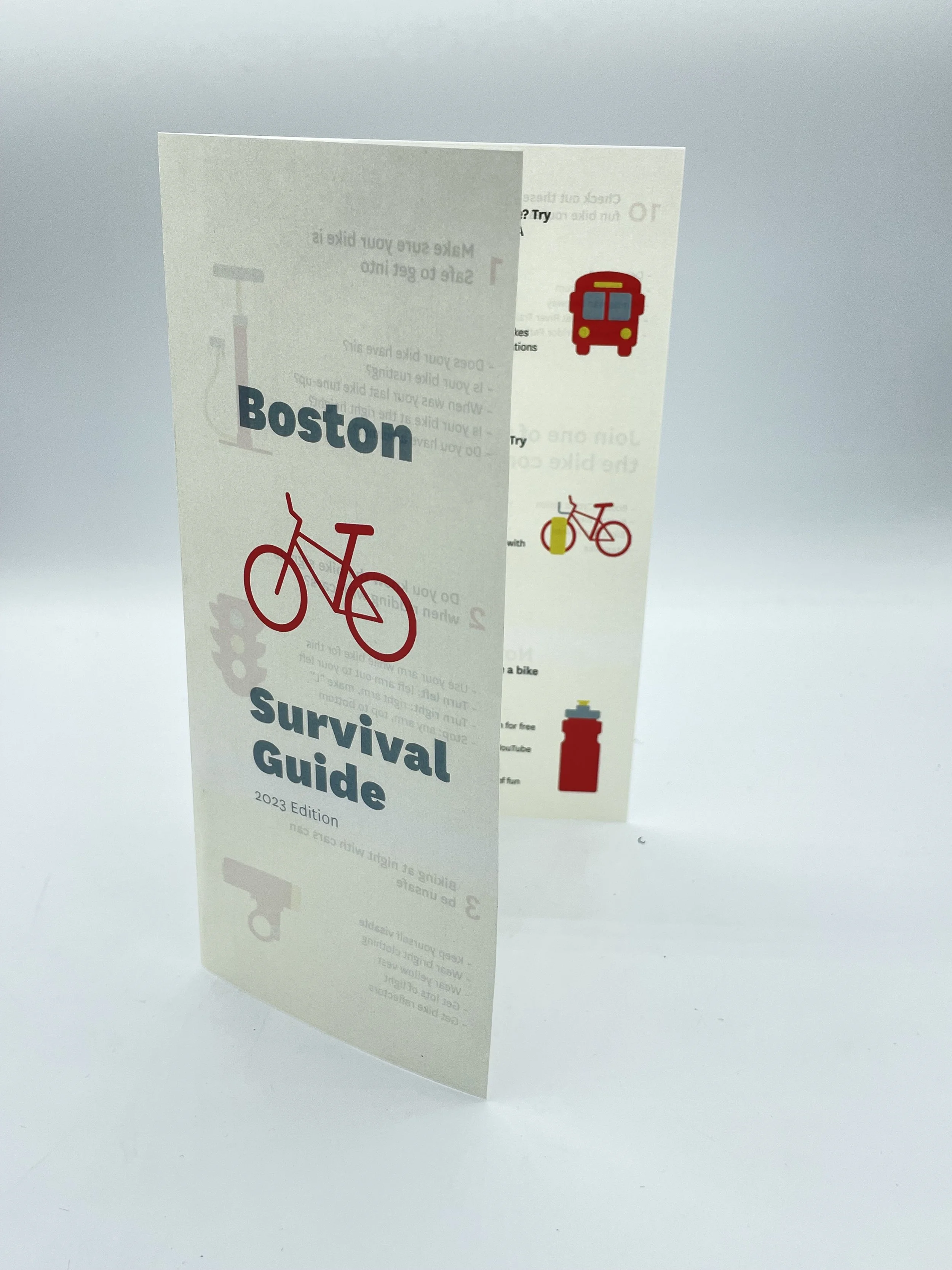
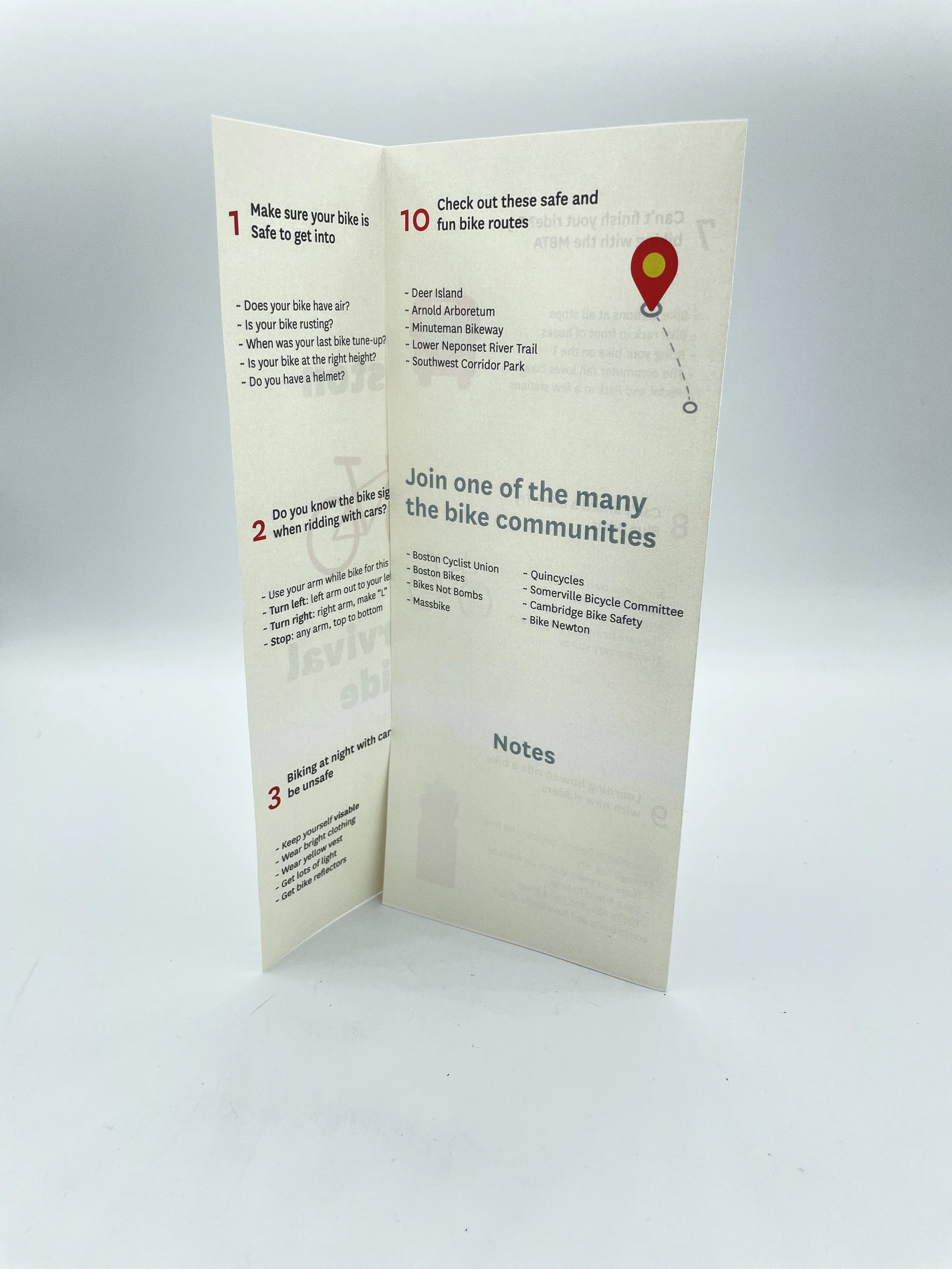
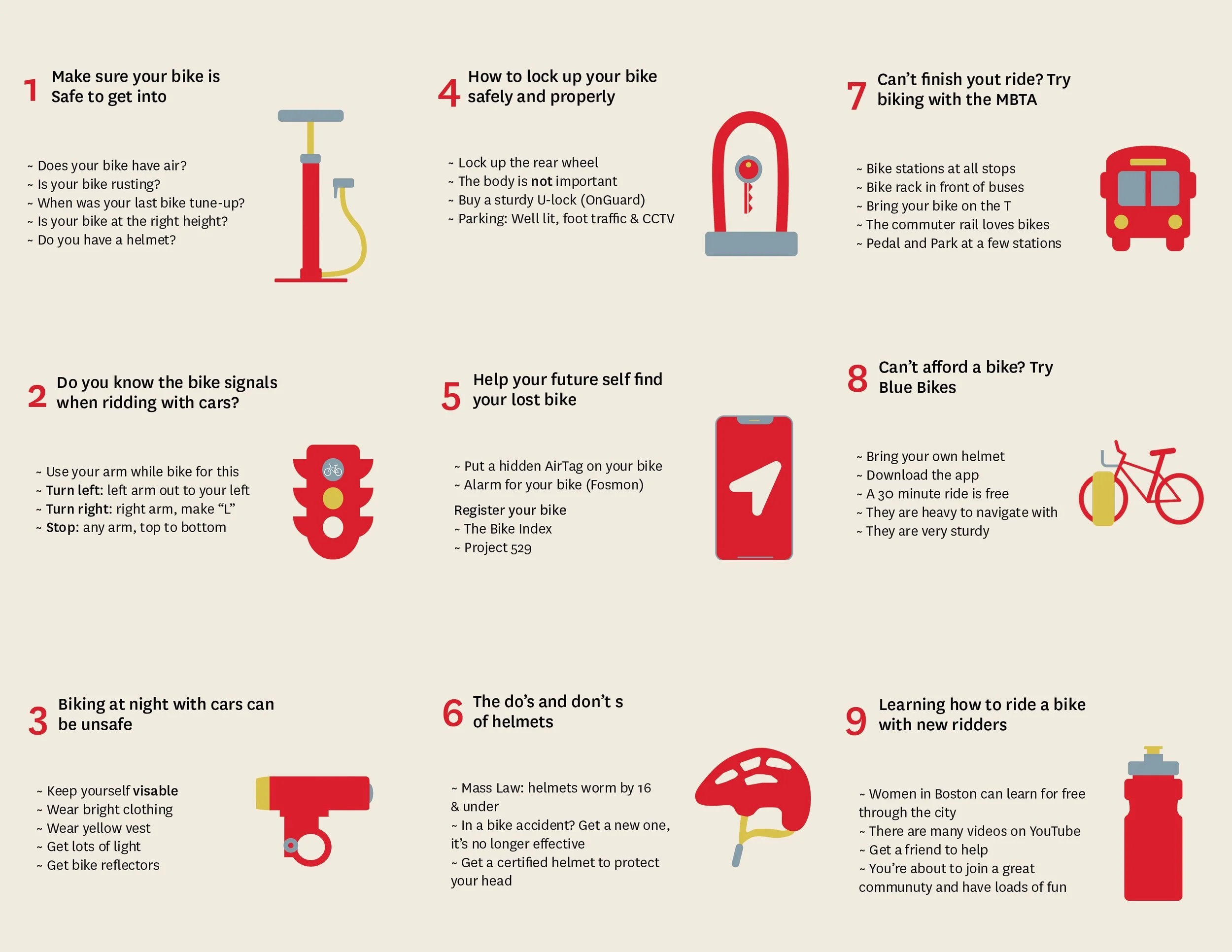
His goal was a goal to make new bikers be less afraid and overwhelmed and informed. When it came down to designing his project he wanted to make people feel safe and informed so he developed a small community online and made a pamphlet that can easily be accessed on the website by printing out the pdf, folding it up, and taking it with you on your bike. for easy access, the designer wanted 10 simple and digestible recommendations that wouldn’t overwhelm new Boston
bikers so he stuck to just 10.
Website
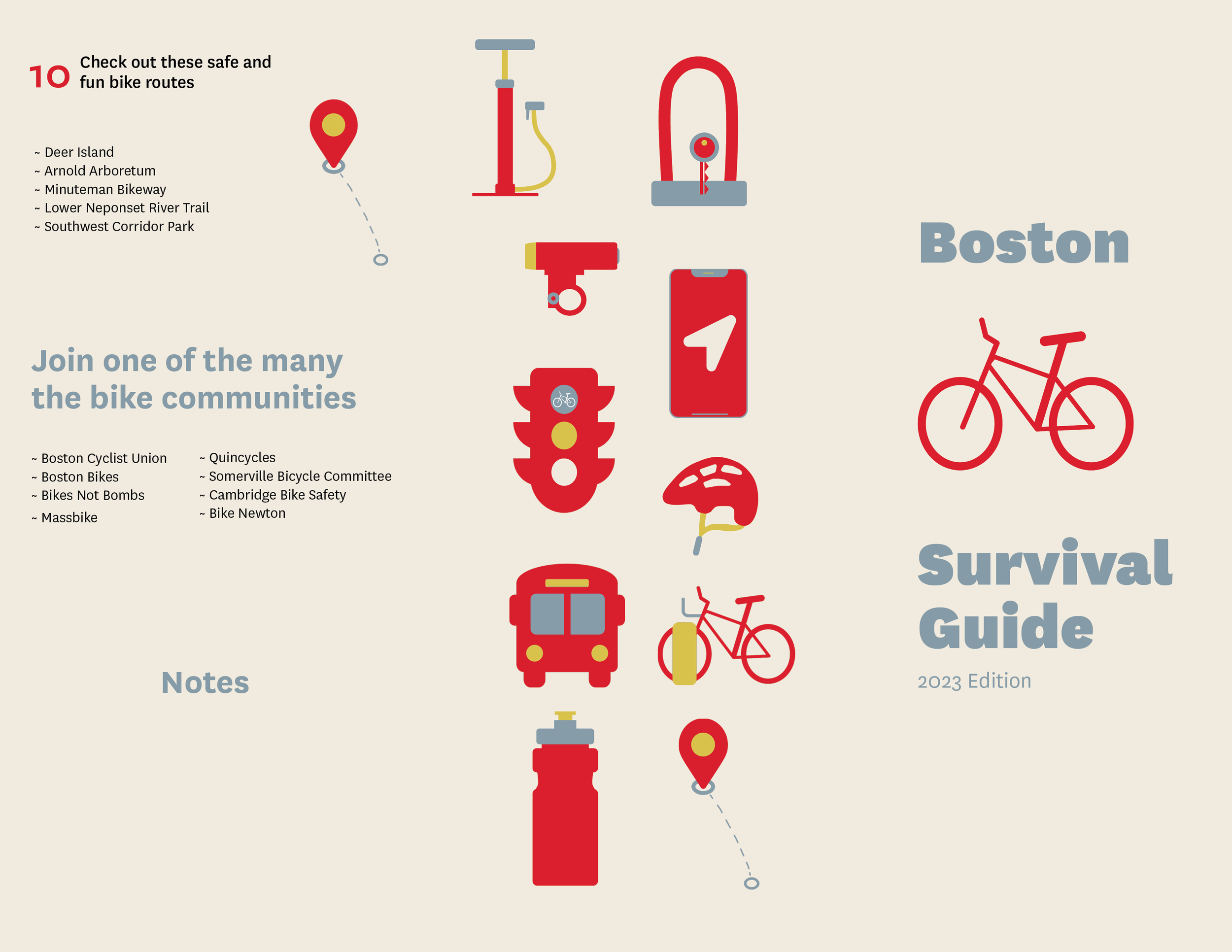
Pamphlet
The colors were inspired by famous bikes and bikers that moved biking forward and the typeface was chosen because its round and friendly shape felt appropriate to the project. The pamphlet was designed for the universally used 8.5 x 11 paper size and the websites were designed on a MacBook Pro 14-inch and an iPhone 13 Pro Max and the project was completed in April of 2023.


